This report is a summary of Citi Bike usage in Jersey City for 2018. Starting last year, Bike JC has run its own annual analysis of the bike share system in order to provide information to the public and promote discussion of biking and Citi Bike in our community.
Citi Bike in Jersey City is an extension of the system operating in New York City. It is managed by the private, for profit corporation Motivate (acquired by Lyft) and data about all bike trips is publicly available via their website. There is currently no official reporting by Motivate or the city government about usage of the bike share program.
In the following sections, we will provide statistics and data visualizations on details such as the number of trips, demographics of riders, length of trips, and frequency of station and route usage. When relevant, we will also compare these figures with 2017 metrics.
Key points:
- Roughly 354,000 Citi Bike trips were taken in 2018, an increase of 19.9% over 2017.
- The most used Citi Bike station was Grove Street PATH, serving as the start or end point for about a 25% of all trips.
- While a majority of trips are taken in Ward E (Downtown), the fastest growing individual stations (in terms of percentage growth) are in Ward D and B. These increased about 60% vs 2017. Several of the stations with flat or declining trip numbers are located in Ward E near the waterfront.
- Similar to last year, the most commonly traveled routes are to and from PATH stations. Several of the routes with the greatest percentage growth involve stations in Wards D, B and C.
Overall Usage
The number of Citi Bike trips starting or ending in Jersey City has increased 19.9% from last year. In total, there were 353,892 trips recorded in 2018. This headline number shows another year of double digit growth and an acceleration relative to the 19.1% growth between 2016 to 2017.
Biking follows a seasonal pattern and breaking down total number of trips by month will show if this increase is uniform or concentrated during certain periods. Both 2018 and 2017 data will be plotted for comparison.
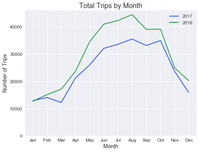
Visually, it is apparent the greatest number of trips occurred in May through October, peaking in August (with 44.5K trips). Not surprisingly, these months have the best weather for biking. Data on winter and early spring, still show an increase relative to last year, but smaller so.
When looking at the percent change, the largest difference between 2018 and 2017 happened in March with 40% increase (or approximately 4.9K more trips). This is likely because in 2017 March ridership was low as roads and transit options were significantly disrupted by multiple late-season snowstorms. Other notable differences are May, with a 32% increase over last year and January, which actually saw a decrease of about 2% year over year.
Ridership Demographics
So we know usage is growing, especially in the warmer months. What do we know about who is using Citi Bike?
We can analyze this because trip level data includes the birth year and gender of the rider. It is important to note that no other personal information is included. This information is not complete for about 6% of trips for 2018. For this analysis, we will exclude any missing data.
We will create a table breaking down gender in rows and age buckets in the columns.
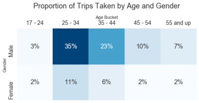
This first thing we’d like to call out is this breakdown is very similar to the what we saw in 2017. The largest share of city bike trips are taken by men age 25 to 34 (35%) followed by men age 35 to 44 (23%).
While a majority of riders are younger and male, this table also reflects the diversity of the riders that rely on bike share. Women age 25 to 34 are the third largest share of trips (11%). They saw a slight uptick since last year when they made up only 10% of trips. Also nearly 10% of riders are over 55.
Trips by Time of Day and Day of Week
So at any point in time, how busy is the Jersey City Citi Bike system? In last year’s analysis, we showed that trip frequency differed depending on whether it was a weekend or weekday and on the time of day.
We would expect that to still be the case. We can verify by plotting the average number of trips by day of the week and comparing the patterns. Both data from 2018 and 2017 will be plotted.
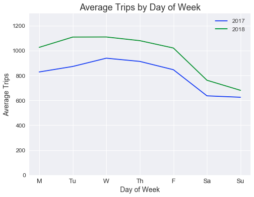
There is a similar shape in the data for both years, but the increase in trips for 2018 is apparent. Trips during the work week saw a 21% increase vs 2017, while weekend trips saw a 14% increase.
This difference is reflective of the use cases for bike share systems. During the week, the average rider is probably a commuter going to and from public transit. During the weekend some riders may still use their bike for commuting, but there is a larger proportion running errands, getting around town, or even going on recreational rides.
This difference can be visualized by plotting average trips by hour and splitting the work week and weekend into different lines. To simplify the visualization, the chart will only have data for 2018.
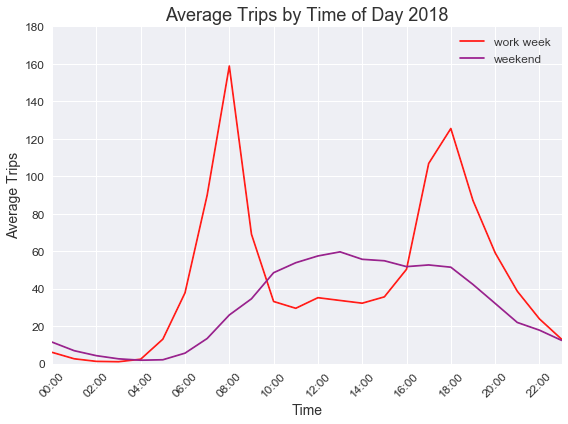
Work days have two very sharp peaks right at prime commuting times, 8 AM (159 average trips per hour) and 6 PM (125 average trips per hour). Weekend data shows a more gradual rise and fall with a peak around 1 PM (60 average trips per hour). The work week actually sees lower usage than weekends between the hours of 10 AM through 4 PM.
Citi Bike Stations
The final, and most complex part of this analysis is geographic. Where are people riding to and from? How far are they going?
There are so many possibilities for a single trip. Anything from a 5 minute commute downtown to the PATH or an hour long ride that starts and ends at the same bike station. A few trips recorded in our data even took riders into Manhattan.
Citi Bike operates via fixed docking stations where all bikes are picked up from and returned to. These stations can be relocated throughout the city as Motivate sees fit. Locations of the docking stations has a massive impact on who has access to the system and what part of the city see the most usage. In 2018, Motivate closed 8 stations, citing low usage. Closures were primarily in the southernmost neighborhoods of Jersey City and service was expanded in the most affluent parts of the city. Bike JC issued a statement urging Motivate and the city to do more to ensure equity in service.
Below is a table showing the number of Citi Bike stations in each ward of Jersey City (as of December 2018).
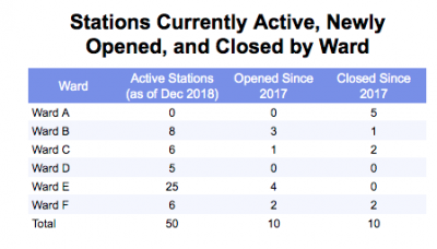
As noted earlier, no stations currently operate in Ward A. Of the 50 total stations 27 are in the more affluent, Downtown area (Downtown is primarily Ward E, but a portion sits in Ward F, where two of its stations are located). Another detail to note is that the total number of stations has not increased since 2017. Effectively they have just been moved between areas.
Which stations get the most and least use? Below we will show a table with the total number of trips that started or ended at each station in 2018.
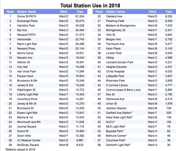
Stations near a PATH train station all make up four of the top five stations, including Grove Street PATH, Exchange Place, Sip Ave, and Newport PATH. Amazingly, Grove Street PATH station makes up about a 25% of all trips city-wide. It served over twice as many trips as the number two station.
Other notable stations include Hamilton Park. A neighborhood that is located about 15 minutes walking distance from either PATH train, residents seem to have embraced the bikes as a way to get around. Harborside and Main Light Rail are two other frequently used stations near other light rail stations. Also the stations with the least use have particularly low numbers because they were only were open for part of 2018. Most were closed in April, but even in the few months they were open, they did not get much use.
How has station use changed since 2017? Below is a chart with similar content, but ranked by the change in number of trips year over year. To ensure an equivalent comparison, this only includes at stations that were around for all 24 months between January 2017 and December 2018.
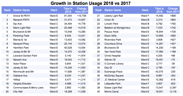
Grove Street PATH is also the station with the largest increase in the number of trips. 2018 had nearly 11K more than in 2017. Other PATH adjacent stations also grew year over year.
Looking at the data this way, a new story emerges. Some of the fastest growing stations in terms of percentage growth are outside of Ward E. Leonard Gordon Park and Pershing Field grew 62% and 61% respectively, both in Ward D. Union St in Ward B grew by 60%.
Certain stations are not growing or use has declined. While Morris Canal is ranked 9th in total trips, it is ranked last for growth, 3K fewer trips than 2017. Exchange Place, despite being near transit has actually slightly fewer trips than last year. Both are located in Ward E. From this, it appears the system has a great potential to continue to grow outside of Downtown and may have reached a plateau in usage near the waterfront.
Trip Distance and Routes
The final two questions we have to answer are: 1) How long are riders traveling for? 2) Where are they going to and from? As stated earlier, the complexity of this data would allow for countless data cuts and visualizations. We will try to keep this relatively straightforward.
The first question is trying to determine, are the trips taken typically short or long? While we cannot measure exact distance, we can take the difference between the time the bike was checked out and the time the bike was locked up, the total travel time.
The following chart will be a histogram representing the distribution of trip times. The height of each bar represents the number of trips that fall within the time range on the x-axis. An example to help you interpret the data, the height of the first bar can be read as the number of trips that took more than one minute, but less than two minutes.
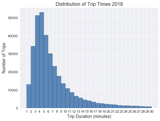
The distribution is concentrated on the left side of the chart, meaning most trips are shorter. The greatest proportion of trips lasts between 4 and 5 minutes and 42% of trips are 5 minutes or less. This is very similar to 2017. Longer trips do happen, but they are a small proportion. Only about 12% of trips are longer than 15 minutes.
There is a clear skew towards shorter trips. So which stations are riders traveling between? We can determine that because the trip level data has the name of the station where it started and the name of the station where it ended. By identifying every unique combination of start and end points and counting how often each appears in the data, we can determine if certain routes are more common than others.
The following table lists the 25 most common routes and the number of times each was traveled in 2018.
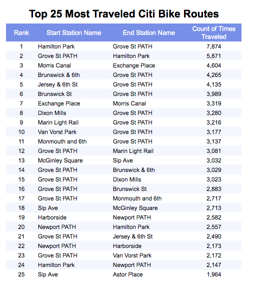
The key takeaway from this table is that all of the top 25 routes either start or end at a PATH station.
A few other items on the list are notable, including:
- Travel between Hamilton Park and Grove St Path are the two most traveled routes.
- Despite a reduction in trips taken to and from Morris Canal overall, trips between it and Exchange Place are the third and seventh most traveled routes.
- Harborside, a station opened in 2017, has become part of a popular route with Newport PATH.
Reorganizing this data to analyze growth provides another perspective. Below is a table that orders each route by the growth in trips in 2018 compared to 2017.
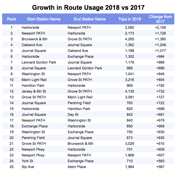
There is a slight skew towards stations that opened mid-2017. Their growth numbers are large because their total trip count for 2017 were low because they were only open for part of the year. Still, this table shows areas of growth for the system across the city.
The route with the greatest growth is Harborside to Newport PATH, also in the top 25 routes overall. Other important routes include stations outside of the Downtown area, including Ward D (Oakland Ave , Leonard Gordon Park, and Pershing Field), Ward B (Astor Place), and Ward C (Journal Square, Dey Street, and Sip Ave). Again this highlights the importance of paying attention to the city as a whole when it comes to where growth will come from.
Conclusions & Questions
While this analysis looks at the trends in Citi Bike usage, it cannot tell us much about important policy questions. These topics are important for our city to consider as we work to make it friendlier to bikes and public transit, while ensuring equity in service to all residents.
Jersey City subsidizes Citi Bike for residents qualifying for public housing and SNAP benefits. How many residents that qualify are aware of this benefit? How many qualifying residents even have stations close to their homes?
How can we improve road infrastructure to support cyclists (though better signage, barriers, or even bike lanes)?
What would be the impact of other kinds of bike share systems such as electric pedal-assist bikes or dockless bikes?
What changes could Citibike make to encourage more weekend usage/membership growth? Perhaps longer time limit for rides on Saturday and Sunday to allow more recreational cycling in places like Liberty State Park where no docks exist?
To all readers, do you feel there were factors that play an important role in the analysis that we did not consider? Are there any problems with the analyses or conclusions in this article? Please share your thoughts and help us improve! Contact us at hello@bikejc.org or on Twitter @bikejc.
Data analysis performed by: Richard Trent
Data source: Motivate
Analysis: Github
Additional Tables: Google Sheets
.png)
.png)
.png)
.png)
.png)
.png)
.png)
.png)
.png)
.png)


